 Rawboard
Start with the questions, not the file
A good report answers a few clear questions. For a shop or practice, usually:
- How much did I sell in the period and how does it compare with the previous one?
- What sells: which categories, which products, which went up or down?
- Who sells: which salesperson or location brings how much?
- When: which weekdays and hours work best?
If you start with these four questions, you know which columns you need from the export (date, value, product or category, salesperson, location) and you ignore the rest.
The steps in Excel
- Clean the export. Keep one header row, no merged cells, no blank rows in the middle. If the file has titles above the table or total rows at the end, remove them: otherwise they are counted twice.
- Check data types. Dates must be real dates, not text, and amounts must be numbers. “1.234,50” or “150-” (negative with a trailing minus) do not add up as numbers in every version.
- Insert a pivot table (Insert → PivotTable). Drag “Category” to rows and “Value” to values, then “Date” grouped by month.
- Add filters: salesperson, location, period.
- Compare with the previous period in a second column or a second pivot, then calculate the percentage difference.
- Make a chart and check the total: the sum across categories must equal the total in the export.
The traps that corrupt the figures
| Trap | What happens | How to catch it |
|---|---|---|
| Total rows in the export | counted twice, the total doubles | compare your sum with the total in the file |
| Numbers stored as text | they do not add up; zeros or errors appear | left-aligned cells, a green triangle, SUM returns 0 |
| Mixed date formats | 03/04 can be 3 April or 4 March | sort the dates and see whether the order is logical |
| Thousands vs. decimal separator | is “1.234” 1234 or 1.234? | check a few rows you know |
| Several sheets (one per month) | they have to be merged, or you analyse one month only | check the number of sheets and the period |
| Days repeated between two exports | the same sales enter twice | compare the files’ date ranges |
The no-pivot, no-formula route
If you do not want to redo the steps above every time, an app that reads the export and gives you the figures directly shortens the work. Rawboard is my app for that: you load a report from Excel, CSV, a text-based PDF or Word and it shows the key numbers in seconds. It recognises the header, columns, period and total rows on its own (it does not count them twice), reads different date and number formats, merges sheets with the same layout and builds a dashboard per topic (sales, stock, people, orders).
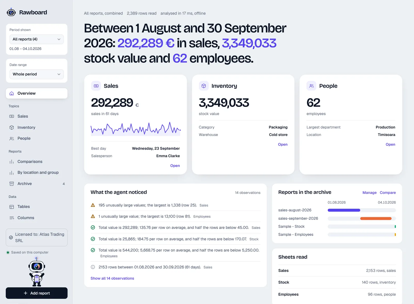
You filter in one click: press a bar, a slice or a day and the whole topic recalculates. Hover over a chart and you see the value, its share of the total and the deviation from the average. The file stays on your computer: the app is not allowed to open any internet connection (see Why your company report should not be uploaded to just any site).
What to do with the report
A report is only useful if it leads to a decision. Once you have the figures, run three checks: what went up or down against last month (comparing two months), where the difference sits (category, salesperson, weekday) and what you do differently next month. For an optical store, seven indicators to track monthly help you choose what matters.
Frequently asked questions
Can I build a sales report in Excel without a pivot table?
Why does my total not match the export’s?
Which files does Rawboard read?
Can I try Rawboard without buying?
Sources and further reading

Optometrist with over ten years in medical optics. Writes about what works in a real practice or shop, and builds the apps that daily work called for.
About the author